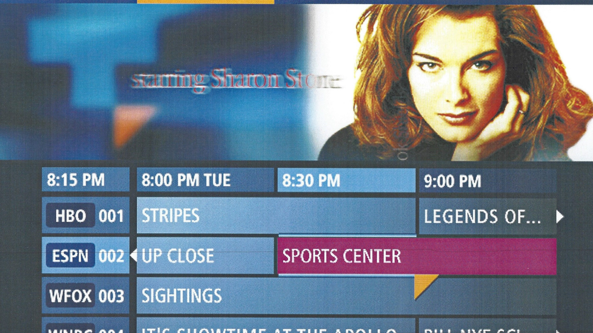
The Challenge: To find commonality in diverse user goals so that we could provide a structure that could easily adapt to whatever content the clients dreamed up.
The Result: A consistent underlying architecture, visual vocabulary and consistent cues so the viewer could trust each cue mapped to one button on the remote did the same thing on every screen. The consistency of layout, visual and audio cues worked in a way to make the complex functionality seem integrated with easy on-boarding.
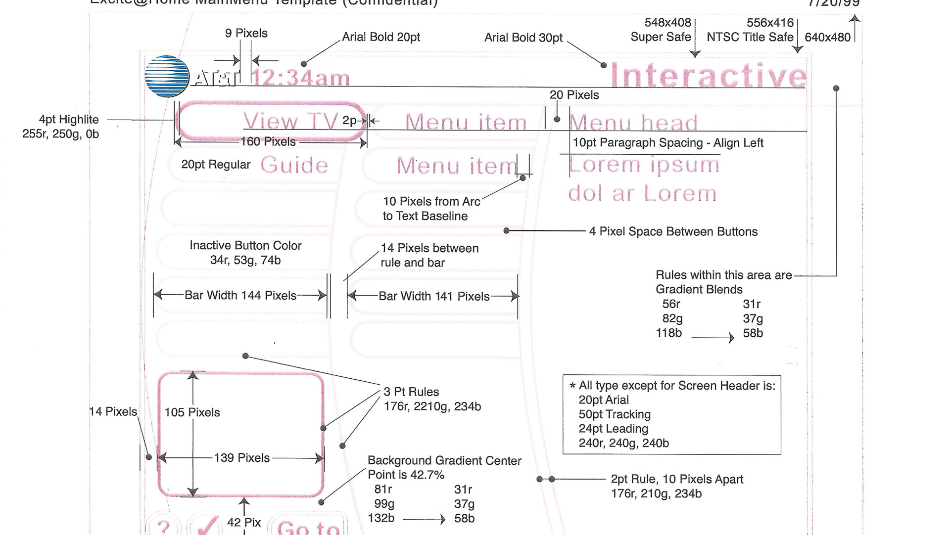
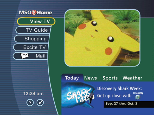
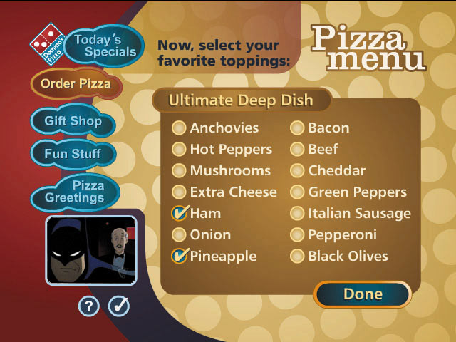
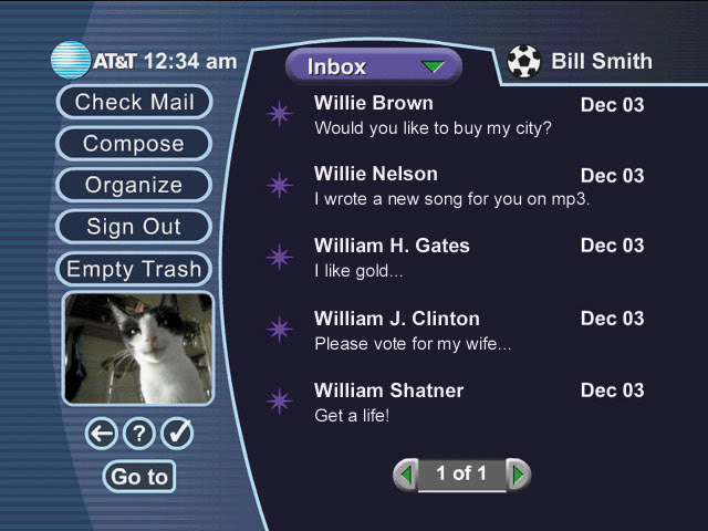
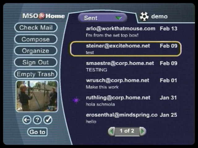
We crafted all experiences onto a template that begins with a menu area to the left, and a content area to the right.
Settings, Help and Navigation along with streaming television was available on every screen.
Additional menus could add versatility to the choices available in the content area.
The main menu is available with the left arrow and also tabbing up the menu list.
The same menu structure carries over for fully functional email, complex Settings and full Help screens.
For more involved tasks the "Gumby head" swooped in to help the viewer focus on the task at hand.
Notice the page numbers at the bottom so the viewer can track progress. Each "Gumby" screen involves a single task, so data entry goes quickly.
Remember that all graphic elements are easily resculpted and skinned for each of the many cable companies funding the project
Adapting a credit card purchase to our format was a real test of design ingenuity.
I am particularly proud of this one and the wire frame structure was adapted for all reuse for other multi-step functionality.
Many of the techniques we developed for limited size television screens were the first instance of these information structures that are common on mobile devices today.
